Choosing the right color scheme for family pictures can make the difference between a photo that looks chaotic and one that looks harmonious, timeless, and connected. While what to wear and how to pose are vital pieces of any photography session, color plays a silent yet powerful role in setting the tone and emotion of the image. Photographers and stylists agree that thoughtful color coordination enhances the visual storytelling of family portraits.
TL;DR (Too long, didn’t read):
The best color schemes for family pictures include neutrals, earth tones, soft pastels, and monochromatic palettes. These create cohesion without being too “matchy,” and they help the focus remain on the family instead of loud clothing. Coordinating—not matching—is key, with layers, textures, and accessories adding depth. The season, location, and background also matter when choosing your colors.
Why Color Coordination Matters
A successful family photo is all about cohesion. While everyone bringing their favorite outfit sounds practical, it often results in clashing colors and distractions. Coordinated color palettes create unity in the group without sacrificing individuality. They allow personalities to shine while aligning with the aesthetic of the photo session.
Photographers love visually balanced imagery. When colors clash, eyes bounce around the photo. When tones blend harmoniously, the photographer can guide the viewer’s attention—often toward faces and emotions—rather than bold patterns or jarring shades.
Top Color Schemes for Family Pictures
1. Neutral Tones
Neutral tones are a go-to for photographers because they never go out of style. They work well across all seasons and complement both urban and natural settings.
- Shades like cream, beige, taupe, white, and soft gray
- Perfect for beach locations, minimalist backdrops, and golden-hour sessions
- Great for large families as they simplify coordination
To avoid looking too plain, incorporate textures—knit sweaters, linen shirts, or lace dresses add visual interest without relying on bright colors.
Image not found in postmeta2. Earth Tones
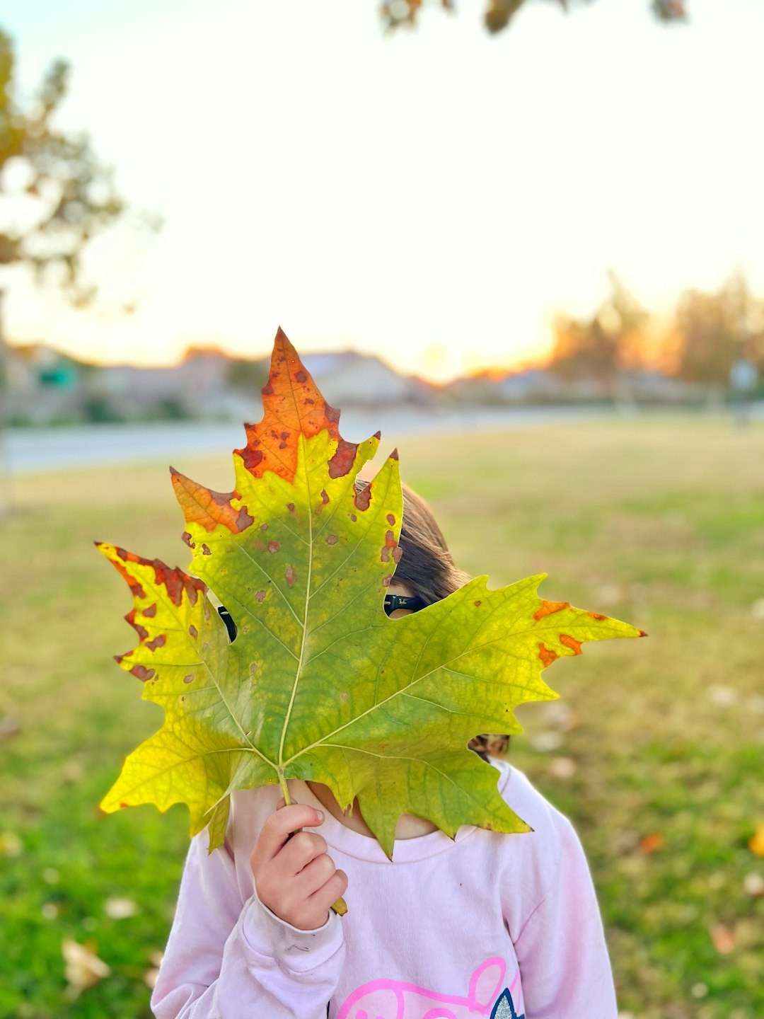
Earthy palettes are particularly popular during fall sessions. These warm and rich colors enhance seasonal hues like falling leaves and natural wood settings.
- Mustard yellow, olive green, rust, deep red, and chocolate brown
- Layered looks in these shades create depth and richness
- Ideal for park, forest, or wooded locations
Earth tones are flattering on all skin types and subtly draw attention to expressions, making them a photographer’s favorite for capturing soulful, warm photos.
3. Soft Pastels
Soft, washed-out pastels look delicate and dreamy, especially in spring or summer shoots. These tones complement natural light and create a romantic, light-hearted mood.
- Colors include blush pink, baby blue, lavender, mint green, and soft peach
- Perfect for floral gardens, beaches, or sunlit indoor studios
- Combine well with white pants, denim, or soft gray as neutrals
Pastels photograph beautifully in early morning or late afternoon lighting and are a great choice for maternity or newborn sessions as well.
4. Monochromatic Color Schemes
This approach involves using different shades of a single color. It adds cohesion while still allowing members to choose pieces that reflect their style.
- Tones of blue: navy, sky blue, denim, periwinkle
- Shades of gray: charcoal, silver, stone
- Tints of green: sage, hunter, moss
Using a monochrome palette means you can create harmony simply by varying textures and tones. It reduces distractions while still giving your photo depth.
Color Schemes to Approach with Caution
1. Bright and Neon Colors
Neon shades can reflect light onto skin, giving people an unnatural hue under the camera. Moreover, these shades can easily overpower the rest of the image and become a distraction.
2. Over-Matching
Gone are the days of matching white shirts and blue jeans. Identical outfits can make the photo look flat and dated. Coordinating colors, instead, provides identity while ensuring visual harmony.
3. Busy Patterns and Logos
Big graphics, logos, and large patterns can draw the eye away from faces. Subtle florals or muted plaids can work if balanced across the group, but it’s best to keep patterns minimal and soft.
Consider the Setting and Season
Where and when the photo is taken can greatly influence which color palette will work best. The background significantly impacts how your color choices will appear.
- Autumn: Embrace rich hues like terracotta, mustard, forest, and rust.
- Winter: Think soft jewel tones and neutrals—navy, burgundy, camel, and gray.
- Spring: Light shades shine—pastels, creams, and soft blues.
- Summer: Go airy—light neutrals, whites, pale blues, and linen tones.
Also consider the backdrop. A beach session, for example, shines with whites and light blues to complement the neutral sand and sky. In contrast, a shoot in a pine forest benefits from warm neutrals and earth tones.
Tips to Coordinate Outfits Naturally
- Start with One Piece: Choose one key outfit—perhaps mom’s dress—and base the rest around it.
- Limit the Color Palette: Stick to 2-3 main colors and spread them across different pieces.
- Add Texture: Layers, scarves, and knits photograph well and make outfits more dynamic.
- Plan Ahead: Lay all outfits side by side on a bed to view the ensemble as a group.
Above all, make sure everyone feels comfortable. If a child hates their outfit, no amount of color coordination can save the photo from a frown.
Conclusion
Choosing the right color scheme for family pictures doesn’t have to be stressful. With a little pre-planning, a unified but not overly matched look can elevate your photos and ensure timeless results. Leaning into neutrals, earthy tones, or gentle pastels depending on your setting will help set the right tone while letting your family’s personality shine through. The goal is harmony, not perfection—after all, the heart of family pictures is capturing connection and joy.
Frequently Asked Questions
What’s the easiest color palette for large families?
Neutral tones like cream, soft gray, and tan are easiest to coordinate across large families. They’re timeless and complement each other across various skin tones and outfit styles.
Can bright colors work in family photos?
They can, but they should be used strategically and sparingly. For example, one person wearing a bright scarf or accessory can work if most others are in more muted tones.
How far in advance should outfits be picked?
At least 1–2 weeks in advance gives time for coordination, resizing, and adding accessories without last-minute stress.
Do we all have to shop for new outfits?
Not necessarily. Many great shoots involve using what families already own. The key is balance and coordination, not brand-new clothing.
Are black and white good for family photos?
Black can sometimes look too harsh or drain facial features. When used in moderation and balanced with lighter tones, it can still be effective. Pure white may overexpose in sunny locations, so off-whites or creams are often preferred.