
Filters are like spices for photos. A little can make an image sing. Too much can make it taste like glitter soup. The trick is knowing what each filter does, and when to use it.
TLDR: Filters help designers change mood, focus, color, and style fast. For example, a café poster can feel warmer with a vintage filter and more dramatic with high contrast. In a small social media test, a brightened product image can often get 20% to 35% more clicks than a dull one. Use filters with purpose, not panic.
Why Filters Matter
A filter is not just a fancy button. It is a design choice. It can make a photo feel calm, bold, dreamy, clean, old, futuristic, or loud.
Good filters help people understand the message quickly. A soft filter may work for skincare. A sharp, punchy filter may work for sports gear. A black and white filter may work for a serious story.
Here are 20 photo editing effects every designer should know.
1. Brightness
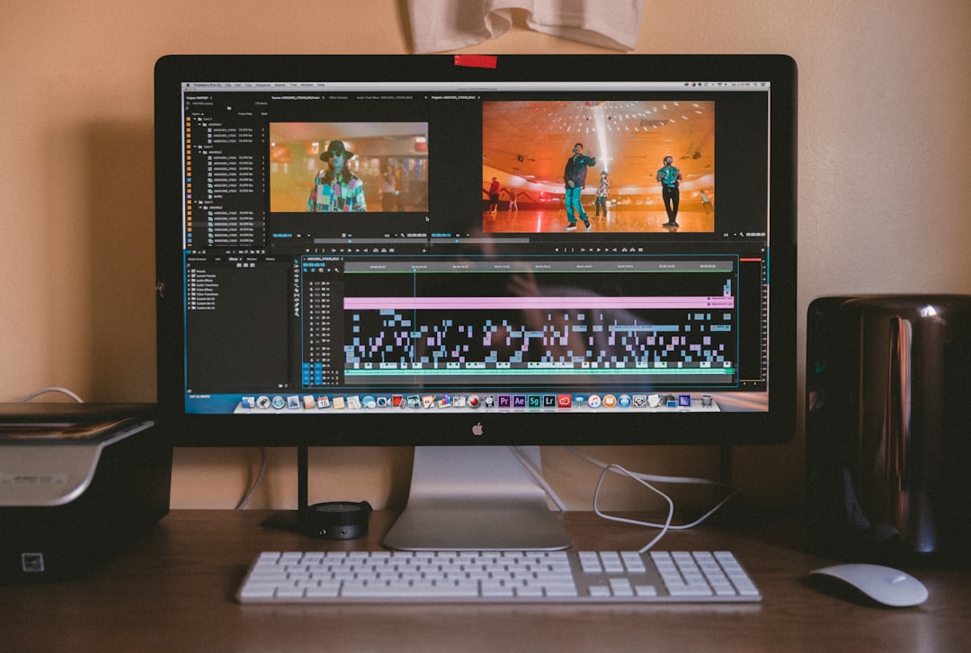
Brightness makes an image lighter or darker. Simple, yes. Powerful, also yes.
Use it when a photo looks too dim. But do not blast it. If everything turns pale, you went too far.
2. Contrast
Contrast controls the difference between light and dark areas. More contrast makes an image pop. Less contrast makes it soft.
Use high contrast for ads, posters, and bold social posts. Use low contrast for gentle, calm designs.
3. Saturation
Saturation changes how strong the colors look. More saturation means brighter colors. Less saturation means muted colors.
A food photo often loves more saturation. A luxury brand may prefer less.
4. Vibrance
Vibrance is saturation’s smarter cousin. It boosts dull colors without ruining skin tones as much.
Use it for portraits, lifestyle photos, and travel images. It gives energy without making people look orange.
5. Warmth
Warmth adds yellow, orange, or red tones. It makes photos feel sunny and friendly.
Use warmth for cafés, family photos, autumn scenes, and cozy product shots.
6. Cool Tone
A cool tone adds blue or green tones. It feels fresh, clean, or serious.
Use it for tech, health, winter themes, or modern business designs.
7. Black and White
Black and white removes color. It puts focus on shape, light, and emotion.
This effect is great for portraits, documentaries, fashion, and strong editorial layouts.
8. Sepia
Sepia gives a brown, old-photo look. It feels vintage and nostalgic.
Use it for history themes, handmade products, old stories, or retro posters.
9. Vintage
A vintage filter adds faded colors, soft contrast, and a little age. It says, “This photo has memories.”
Use it for music posters, thrift shops, weddings, and lifestyle branding.
10. Fade
Fade lowers contrast and softens dark areas. It creates a calm, airy look.
Use it for fashion, beauty, wellness, and minimalist social feeds.
11. Sharpen
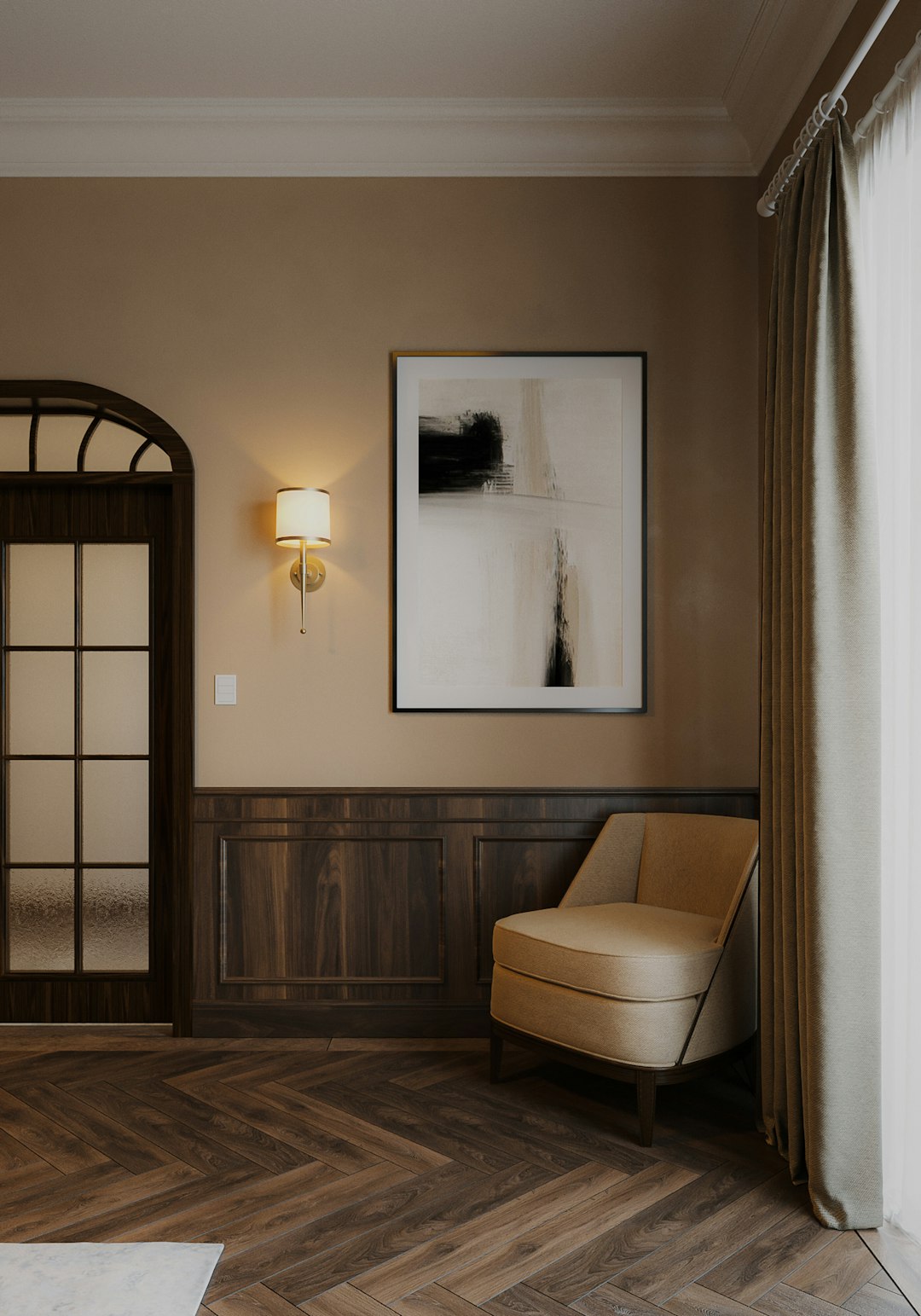
Sharpen makes edges clearer. Details become more visible.
Use it for product photos, architecture, and textures. Be careful with faces. Too much sharpening can show every pore like a tiny mountain range.
12. Blur
Blur softens details. It can hide distractions or create depth.
Use blur in backgrounds, banners, and text overlays. A blurred background makes words easier to read.
13. Vignette
Vignette darkens or lightens the edges of a photo. It guides the eye toward the center.
Use it for portraits, product images, and moody posters. Keep it subtle. A heavy vignette can look like a tunnel.
14. Grain
Grain adds tiny specks to a photo. It can feel film-like, raw, or artistic.
Use it for street photography, music graphics, vintage looks, and indie brand styles.
15. HDR
HDR stands for high dynamic range. It brings out details in shadows and highlights.
Use it for landscapes, buildings, and dramatic skies. Use it lightly. Too much HDR can make a photo look crunchy.
16. Duotone
Duotone uses two main colors. It turns a photo into a bold graphic piece.
Use it for posters, album covers, event graphics, and landing pages. Pick colors that match the brand mood.
17. Gradient Map
A gradient map replaces light and dark areas with a color gradient. It can look wild or elegant.
Use it when you want a photo to match a campaign palette. It is great for creative ads.
18. Color Pop
Color pop keeps one color bright while the rest becomes dull or black and white.
Use it when one object matters most. Think red shoes, yellow bicycle, or blue drink can.
19. Glitch
Glitch adds digital distortion. It feels techy, edgy, and a little chaotic.
Use it for gaming, music, cyber themes, and futuristic event designs. Do not use it for a law firm headshot. Probably.
20. Lens Flare
Lens flare adds light streaks or sun spots. It can feel cinematic and warm.
Use it for outdoor photos, festival posters, travel designs, and emotional scenes. Keep it believable. Fake sun in a basement looks odd.
How to Choose the Right Filter
Start with the goal. Do you want the image to feel happy, calm, serious, premium, or playful?
- For energy: try contrast, saturation, vibrance, or color pop.
- For calm: try fade, cool tone, blur, or low contrast.
- For nostalgia: try sepia, vintage, grain, or warmth.
- For drama: try black and white, HDR, vignette, or duotone.
- For tech: try glitch, cool tone, gradient map, or sharp contrast.
Also think about the platform. A tiny social media thumbnail needs quick impact. A website hero image needs polish. A print flyer needs clarity.
Common Filter Mistakes
Filters are fun. They are also sneaky. One minute you add a warm glow. The next minute your photo looks like it was cooked in cheese.
Avoid these mistakes:
- Using too many filters at once. Pick a main effect. Let it breathe.
- Ignoring skin tones. People should still look human.
- Forgetting the brand. A playful filter may not fit a serious message.
- Over-sharpening. Crisp is good. Crispy faces are not.
- Copying trends blindly. A trendy look can age fast.
A Simple Filter Workflow
Use this easy order when editing:
- Fix light first. Adjust brightness and contrast.
- Fix color second. Use warmth, cool tone, vibrance, or saturation.
- Add style third. Try vintage, grain, duotone, or glitch.
- Guide the eye last. Use blur, vignette, or sharpen.
This order keeps your edit clean. It also saves time. You will make fewer “what happened to this photo?” decisions.
Final Tips
Filters should support the story. They should not steal the whole show. If a viewer notices the filter before the design, lower the effect.
Use your eyes. Step away for a minute. Come back and look again. If the photo still feels good, you are probably close.
And remember this simple rule: edit with intention. A filter is not magic dust. It is a design tool. Use it well, and your photos will look clear, stylish, and full of life.