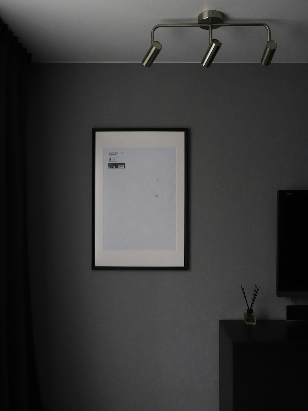
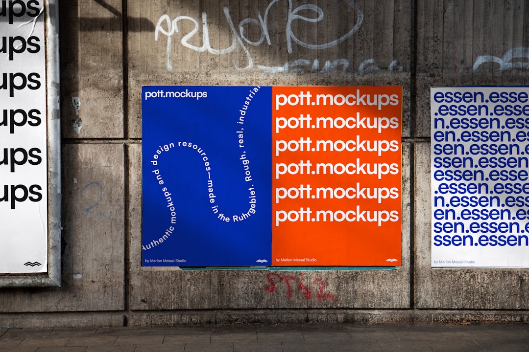
In an age of visual excess and instant gratification, the language of design has followed two diverging paths—ornate overproduction and stripped-down minimalism. Among cinephiles and graphic designers, minimalist film posters have emerged as a striking subgenre that prioritizes essence over embellishment. These posters aren’t just empty space; they are purposefully crafted pieces of communication that aim to evoke an entire cinematic experience with little more than shapes, color, and context.
TLDR
Minimalist film posters use simplicity and symbolic design to communicate a film’s essence without overwhelming the viewer. This article explores the philosophy behind minimalist design, its key principles, and how to create compelling posters using minimal elements. Through deliberate typography, color schemes, and visual metaphor, designers can create memorable cinematic icons. It’s a form of communication that values precision and restraint—and it’s powerful when done right.
Understanding Minimalism in Film Poster Design
Minimalism in design, as applied to film posters, stems from a philosophy of “less is more.” It prioritizes the most essential components of a subject and eliminates anything that doesn’t contribute directly to the message. In the world of film, where posters traditionally aim to capture attention through character montages and dramatic imagery, the minimalist poster offers a breathing space—a moment for contemplation and intrigue.
At its core, a minimalist film poster seeks to represent the soul of a film using a fraction of the visual language. This might mean one object, one silhouette, or a single symbol that acts as a metaphor for the film’s themes or narrative arc. Rather than tell the viewer what to expect, these posters invite interpretation—drawing in an audience who wants to decode the story on their own.
Key Elements of Minimalist Poster Design
Designing a successful minimalist poster is not about doing less work—it’s about doing more with less. To achieve this, designers should focus on the following core elements:
- Conceptual Depth: A minimalist poster must convey a core idea or evoke a mood synonymous with the film. This is where storytelling meets design thinking.
- Simplified Imagery: Use easily recognizable forms or single highlighted objects that act as symbolic stand-ins for larger themes.
- Limited Color Palette: Stripped-back color choices lend coherence to the message and prevent visual overload.
- Whitespace: Negative space is not an absence—it’s a frame that highlights the focal point.
- Typography: Fonts used in minimalist design often convey as much emotion and period identity as the imagery itself.

The Role of Visual Metaphor
In minimalist film posters, symbolism becomes paramount. Without the ability to depict full scenes or character ensembles, the poster leans heavily on metaphor. An oversized black shoe surrounded by confetti could signify the passing of an icon (as in the case of The Death of Stalin), while a partially open door in a pitch-black room might suggest mystery, horror, or deceit.
The key is visual reduction—distilling narrative or character essence into a single, strong symbol. Viewers are then invited to make a mental leap from abstract form to story content, creating a more engaging and memorable experience.
Colors That Speak Volumes
Unlike traditional movie posters that may rely on vibrant color arrays to catch the eye, minimalist posters often limit their palette to 2–3 colors. This restriction enhances the visual focus and adds emotional resonance. The color red might suggest danger, passion, or revolution; blue might evoke melancholy or distance. When used carefully, colors can function as thematic indicators or emotional primers.
Consider the use of monochrome in minimalist horror films, or the vivid primaries in stylized comedies. Each decision must serve the emotional language of the film instead of merely decorating the canvas.
Typography as a Narrative Tool
In the absence of detailed imagery, text carries added weight. The choice of typeface can inform the viewer about the film’s tone, period, or genre as much as imagery does. Serif fonts with vintage weight might invoke period dramas or historical themes, while stark sans-serif types lean toward modernity or minimal drama. Occasionally, the font itself becomes part of the imagery.
Effective typography in a minimalist poster is not just readable—it’s evocative. It plays off the imagery, offers balance, and may even steer narrative interpretation. Proper kerning, spacing, and hierarchy need to be meticulously handled to preserve elegance and clarity.

Composition and Balance
The eye must be guided—but not overwhelmed. In minimalist design, the structure of the poster performs this guidance subtly. Alignments, margins, object placement, and visual hierarchy play critical roles. While the overall presentation feels open and sparse, these posters are rarely disorganized. Balance creates harmony, and that harmony is what allows minimalist posters to captivate rather than confuse.
Symmetry, or carefully structured asymmetry, can provide focal points and visual rhythm. Wise placement of elements ensures that each component supports the next, forming a cohesive and intentional design language.
Historical Context and Modern Trends
Minimalist posters are not a contemporary invention, despite their popularity in today’s design circles. The movement echoes back to the Swiss Design movement and works of modernist graphic designers such as Josef Müller-Brockmann. In cinema, Saul Bass pioneered the use of abstract, minimalist sequences and promotional material as early as the 1950s.
What is modern, however, is the refinement of these ideas alongside digital design tools and the rise of niche fan cultures. Movie buffs and designers alike now view minimalist posters as both art and commentary. This has led to a proliferation of fan-made posters, gallery exhibits, and curated collections highlighting the genre.
Common Mistakes to Avoid
While minimalism might seem easy, it’s easy to get wrong when fundamental principles are misunderstood. Below are mistakes commonly made by novice designers:
- Ambiguity without intent: If your visual metaphor is too abstract, it won’t resonate with the viewer.
- Poor color harmony: Just because the design is minimal doesn’t mean colors don’t need to complement one another.
- Typography misuse: A mismatched or overly stylized font can undermine the intended message.
- Overuse of negative space: While whitespace is a tool, too much of it without visual contrast weakens impact.
Each decision in a minimalist design must be intentional. When restrained too much, the design risks feeling unfinished rather than purposeful.
Conclusion: Why Minimalist Posters Matter
Minimalist film posters are a celebration of restraint, clarity, and concept. They reflect an understanding that power doesn’t always lie in volume—but in focus. When executed well, they do more than sell a film; they create a lasting impression, allowing viewers to connect with the core of the cinematic experience at a glance.
Whether you’re a designer, film enthusiast, or marketing strategist, understanding the mechanics behind minimalist film posters can enhance how you communicate and consume visual media. A great minimalist poster speaks louder than its busier counterparts—not because it says more, but because it chooses every word—and every design element—with care.
