From office buildings to public bathrooms, we encounter them daily—doors that leave us bewildered about whether to push or pull. These are often called Norman Doors, a term named after design expert Don Norman. Despite serving the simple function of granting or restricting access, poorly designed doors cause moments of confusion, hesitation, and sometimes embarrassment.
TLDR
Norman Doors are everyday examples of bad design—doors that confuse users about how to open them because they conflict with natural human expectations. Named after design expert Don Norman, these doors often lack proper affordances, leading to frustration and inefficiencies. This article explores real-world examples, examines why these designs fail, and discusses how thoughtful design can improve user experience. Whether you’re a designer or an everyday user, understanding Norman Doors can sharpen your eye for usability.
What Is a Norman Door?
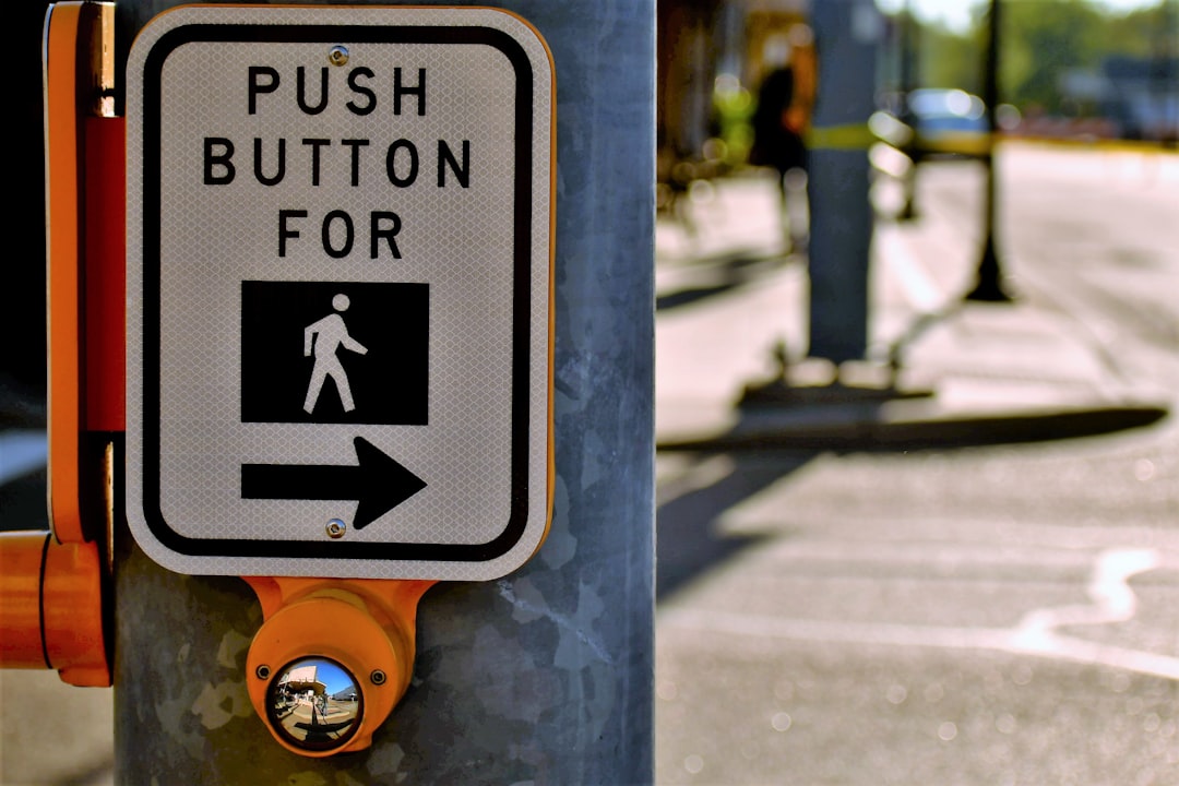
The term “Norman Door” originates from Don Norman, a cognitive scientist and usability engineer who introduced the idea in his book, The Design of Everyday Things. A Norman Door is a door whose design gives the wrong signal about how to operate it. If a door needs a sign telling you how to open it—such as “PUSH” or “PULL”—it’s already a failure in design.
Root of the Problem: Poor Affordances
One of the fundamental concepts in user experience (UX) design is affordance, which refers to perceived and actual properties of an object that determine how it could be used. A well-designed object hints at its function through form alone. For instance, a flat plate on a door suggests pushing, whereas a handle implies pulling. The failure to align design with affordance is at the heart of every Norman Door mistake.
Common Examples of Norman Doors
1. The Glass Door with a Bar
Imagine approaching a sleek glass door adorned with a horizontal metal bar at waist height. The instinct is to push the bar, right? But the sign above it says “PULL.” This clearly violates our natural use expectations.
This miscommunication occurs because horizontal bars typically signal a pushing action. When paired with a pull function, users almost always hesitate and resort to trial and error.
2. Handle on Both Sides
Another infamous example is the door that features identical vertical handles on both sides. Handles universally indicate a pulling action. When such a door requires pushing but uses a handle instead of a push plate, the user struggles to operate it correctly and may feel like it’s locked or broken.
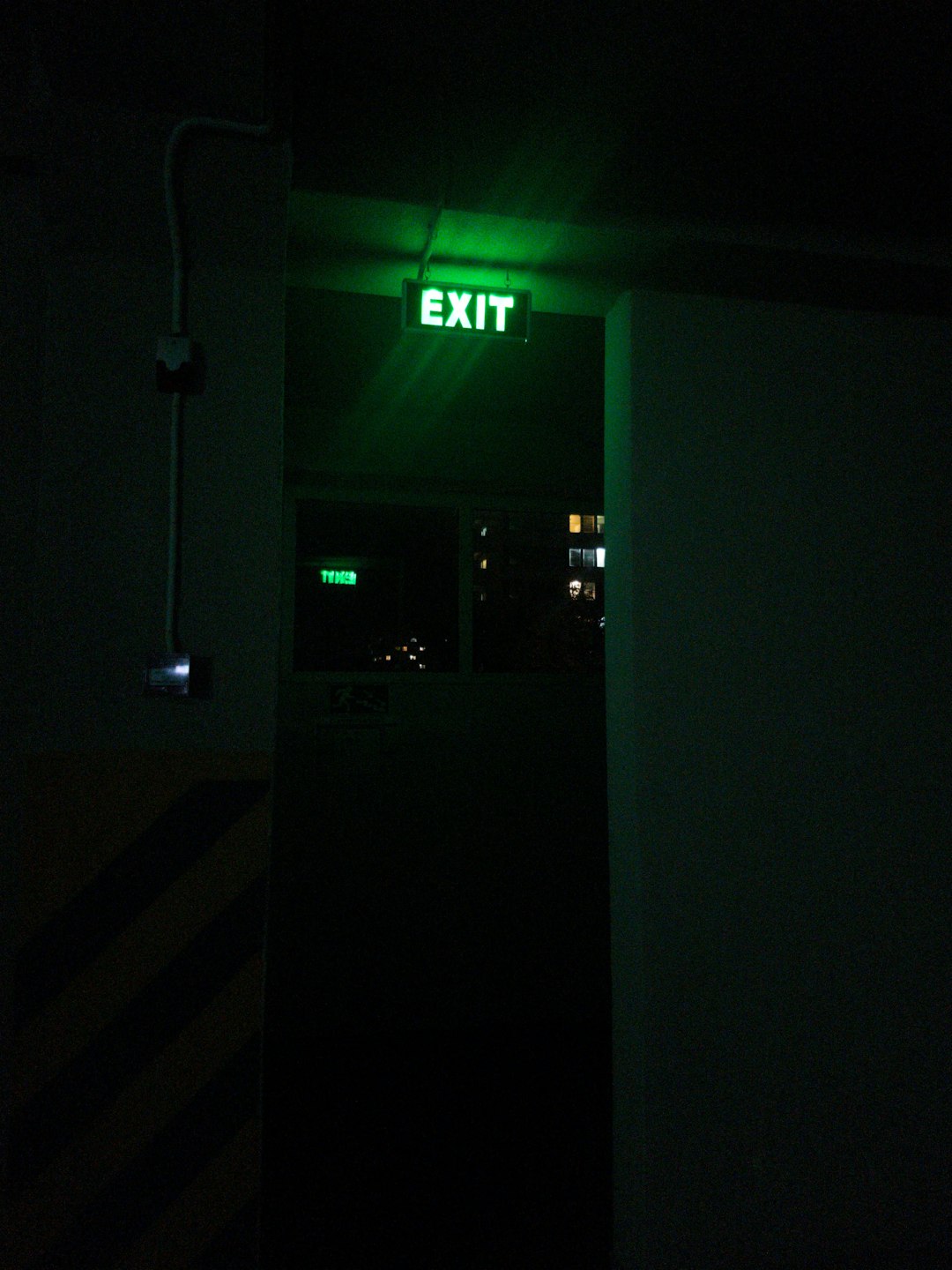
3. Exit Doors with No Indication
Exit routes in emergency situations must be intuitive and quick to operate. Yet many exit doors are so poorly designed that people waste valuable seconds trying to figure out whether they should push, pull, or even twist a knob. This is not just an issue of convenience—it’s a matter of safety.
Why Do These Designs Exist?
The prevalence of Norman Doors isn’t due to a lack of knowledge—it’s often due to misplaced priorities. Architects and designers sometimes prioritize aesthetics over usability. A minimalist glass door may look elegant, but without visible cues, it becomes a usability nightmare.
- Lack of user testing: Designers often create doors that are not tested with real users.
- Visual symmetry: Symmetrical designs make both sides of a door identical, removing cues for interaction.
- Cost-saving: Sometimes, companies opt for cheaper hardware without considering functionality.
Effective design shouldn’t require instructions. If signs are necessary for basic operation, it’s a sign of a flawed product.
Psychology Behind the Confusion
Our brains rely on visual and tactile cues before interacting with an object. When these cues are misaligned, our expectations aren’t met, causing a cognitive friction. This friction leads to hesitation or even incorrect interaction—such as pushing a door that should be pulled.
This concept is known in UX as a mismatch between mental models and system models. Users create their own understanding—or mental model—of how something should work based on similar past experiences. When a door’s design doesn’t match that understanding, confusion ensues.
How Better Design Can Solve the Problem
Solving the Norman Door issue doesn’t require complex technology—just better design decisions. Here are several ways to improve door usability:
- Use visual affordances: Flat plates on push doors and protruding handles on pull doors help users act correctly without instructions.
- Consistent hardware: Don’t mix push plates with pull signs. Uniformity in door hardware helps reinforce function.
- Feedback loops: Allow the door to provide tactile or auditory feedback, reinforcing that the user’s action was correct.
Notably, public safety regulations now require certain types of doors—like emergency fire exits—to open in specific ways with clearly marked hardware. These guidelines offer functional lessons that should be applied more broadly in everyday design.
Not Just About Doors: Broader UX Lessons
Norman Doors serve as a useful metaphor for ineffective user experience design in other domains. Mistakes made in physical spaces are often mirrored in digital interfaces: buttons without labels, icons that are unclear, and links that don’t function as expected.
Consider these digital parallels:
- A mobile app with hidden navigation options that frustrate the user
- A website where form buttons aren’t clearly marked, causing submission errors
- Software interfaces with excessive reliance on tooltips for basic functionality
Each of these examples represents a kind of “Norman Door” in digital form—designs that look typical but confuse users due to poor affordance or feedback.
Famous Quotes from Don Norman
Don Norman emphasizes that design should serve the user, not obscure function. Some of his most cited quotes include:
“When you have to label a door ‘push’ or ‘pull,’ it means that the design has failed.”
“Design is really an act of communication, which means having a deep understanding of the person with whom the designer is communicating.”
Moving Forward: A Call to Better Design
As users, we may tolerate these minor nuisances because they seem insignificant. But as designers and planners, it’s our responsibility to ensure that everyday objects like doors are intuitive and functional. Simplicity and clarity should never be afterthoughts.
Whether you’re working on a new building, app, or consumer product, remember that good design is invisible—you only notice it when it fails. Norman Doors serve as a constant reminder that design should always respect human intuition and reduce friction points between people and the tools they use.
So the next time you reach for a door and hesitate, consider this: It might not be your fault. It could just be another Norman Door.