
Use Figma for notes tied to pixels. Use Notion for notes tied to people, process, and future memory. That is the clean split. If a decision changes what users see, keep it near the design.
TLDR: Figma is best for quick UI decisions, visual comments, and design context. Notion is best for deeper records, approvals, meeting notes, and cross-team reading. For example, a product team with 12 people cut repeat Slack questions by 28% after moving final UI decisions into a simple Notion decision log, while keeping design comments in Figma. Use both, but give each one a clear job.
Why UI notes matter
UI notes sound boring. They are not. They are the tiny bits of memory that stop teams from asking, “Wait, why did we make this button blue?” for the fifth time.
A good UI note explains the reason behind a design choice. It can cover button labels, empty states, spacing, error messages, accessibility rules, and weird edge cases. It saves time. It prevents rework. It keeps product, design, engineering, and support from guessing.
The problem is simple. Notes get scattered. Some live in Figma comments. Some live in Slack. Some hide in meeting docs. Some exist only in one designer’s head. Not great.
So the real question is not “Figma or Notion?” It is “Which note belongs where?”

Figma is best when the note needs a visual home
Figma wins when the decision is close to the interface. It is fast. It is visual. It lets people point at the exact thing they mean.
This is a big deal. Saying “the card title needs less space” in a document is vague. Saying it on top of the actual card in Figma is clear. No detective work needed.
Use Figma for notes like:
- Spacing decisions: “Use 24 px between sections on desktop.”
- Component behavior: “This dropdown closes after one choice.”
- State notes: “Show this message when the list is empty.”
- Copy tied to layout: “Keep label under 18 characters.”
- Accessibility hints: “Error text must stay visible after focus moves.”
Figma also helps engineers. They can inspect the design and read notes in the same place. That reduces back and forth. Nobody wants a 16-message thread about a tooltip.
But Figma notes can become messy. Comments get resolved. Frames get renamed. Drafts sit beside final screens. It drives me crazy that one small comment can feel obvious on Monday and impossible to find by Friday.
Figma is great for working notes. It is not always great for long-term memory.
Notion is best when the note needs a shelf life
Notion wins when the decision needs to be found later. It is better for structure. It is better for summaries. It is better for people who do not live inside design files.
Think of Notion as the team notebook. It tells the story. It holds the “why.” It records who agreed, when they agreed, and what tradeoffs came with the choice.
Use Notion for notes like:
- Decision logs: “We chose tabs instead of filters because users compare categories often.”
- Research links: “6 of 10 test users missed the secondary action.”
- Release notes: “Checkout redesign shipped in version 3.4.”
- Approval records: “Legal approved this consent copy on March 12.”
- Design principles: “Use plain language for all error messages.”
Notion is also easier for product managers, writers, support teams, and stakeholders. They can read a page without opening a giant design file. Nice.
Still, Notion can grow into a junk drawer. Expect to waste time on duplicate pages if nobody owns the system. “Final final UI notes” is not a strategy. It is a cry for help.

The simple rule: pixels in Figma, reasons in Notion
Here is the easiest split.
- Put the note in Figma if it explains something visible on the screen.
- Put the note in Notion if it explains a decision, policy, meeting, or history.
- Use both when the choice is important and easy to forget.
Example time.
Your team changes a “Continue” button to “Review order.” That exact label belongs in Figma. Put the note near the button. Add a short reason, like, “Users thought Continue meant payment starts now.”
Then add the final decision to Notion. Include the test result. Add the date. Add the owner. Link back to the Figma frame. Now the note has context and a home.
This is boring in the best way. Boring systems get used.
How to document UI decisions in Figma
Keep Figma notes short. People scan them while building. They do not want a novel next to a modal.
A good Figma note has three parts:
- What changed: “Primary button label is now ‘Save changes.’”
- Why it changed: “Users did not know if changes saved on close.”
- Any rule: “Use this label on all settings forms.”
Use annotations for stable notes. Use comments for open questions. Do not mix them too much. A comment sounds temporary. An annotation sounds like guidance.
Also, name your frames clearly. “Checkout v7 maybe final” is pain in text form. Use names like “Checkout, approved, Apr 2026.” Simple beats clever.
How to document UI decisions in Notion
Notion needs a repeatable format. Without one, every page becomes a snowflake. Pretty, but annoying.
Try this tiny template:
- Decision: What did we choose?
- Reason: Why did we choose it?
- Evidence: What data, test, or feedback supports it?
- Impact: Which screens, users, or teams are affected?
- Status: Proposed, approved, shipped, or replaced.
- Links: Figma frame, ticket, research, or release note.
This format makes old choices easier to trust. It also helps new teammates. They can learn the product without pulling five people into meetings.
When Figma gets annoying
Figma can hide history. Resolved comments vanish from daily view. Explorations pile up. One file may hold ten versions of the same flow. Then someone asks which one is real. Great. More archaeology.
Figma is also not ideal for broad reading. A support lead may not want to open a design file just to check the reason for a label change. They need a clean page. Not a canvas full of arrows.
So use Figma for the active design layer. Do not force it to become the whole company brain.
When Notion gets annoying
Notion can separate notes from the thing they describe. A page may say “Update tooltip behavior,” but not show the tooltip. Then readers need to open links, hunt for frames, and guess what changed.
Notion pages can also get too long. A decision log with 90 entries is technically useful. It is also a wall. Add filters. Add status tags. Add owners. Your future self will be less grumpy.
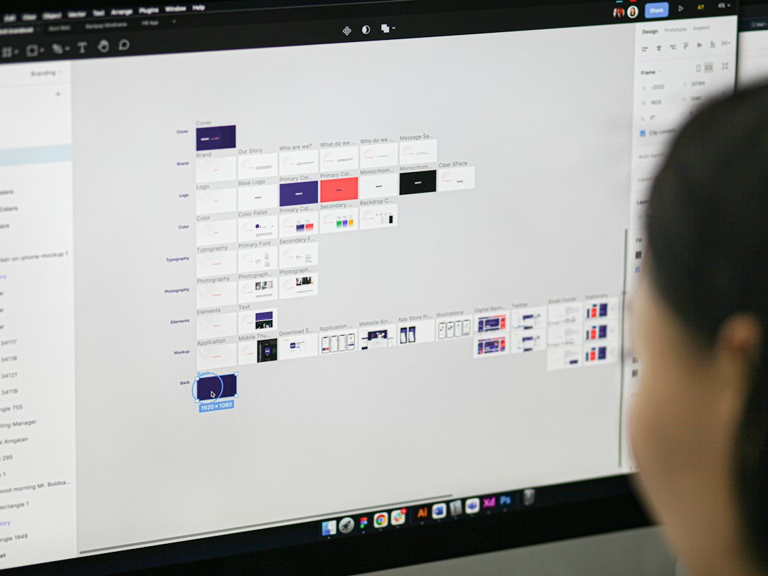
A practical workflow that works
Use this setup if your team wants less chaos.
- During design: Keep rough notes and questions in Figma.
- During review: Mark key decisions with clear annotations.
- After approval: Move final decisions into a Notion log.
- Before handoff: Link Notion pages back to exact Figma frames.
- After release: update status to shipped.
This keeps the work close to the design while it is moving. Then it gives final decisions a stable record.
Which one should your team pick?
If you are a solo designer, Figma may be enough at first. Add a small Notion page when decisions start repeating. If your team has engineers, product managers, and stakeholders, use both from the start.
If your notes are mostly visual, start in Figma. If your notes affect policy, research, roadmap, or support, put them in Notion.
The best setup is not fancy. It is clear. Figma answers, “What should this screen do?” Notion answers, “Why did we decide that?”
Keep pixels near pixels. Keep reasons where people can find them. That is the whole game.