Let’s face it, we live in the digital age, and upon leaving our building, all we want to do is simply put our phone in our pocket, headphones in our ears, and listen to our favorite show. However, TV shows require that attention be paid to moving pictures, so the podcast format was created, which is simply a spoken form of entertainment.
That being said, creating a successful and listened-to podcast is not easy. During the pandemic and the lockdown period, there was a noticeable increase in the numbers of both podcasts and listeners of this format. It is difficult to keep the listener’s attention, as well as attract new ones. That’s why we will suggest some guidelines regarding graphic design, deal with tools to create your cover art, and give a few examples of great cover art.
You have to keep in mind that the best covert art is the one that entices the viewer and sets you apart from a multitude of similar podcasts. Fortunately, you don’t have to be a professional graphic designer or spend huge sums of money to make cover art. You need to know what you want, have a bit of imagination, listen to our advice, and use one of the tools we’ll suggest.
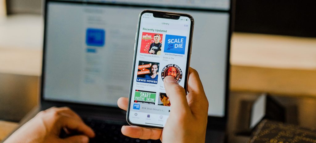
So, let’s start with a few tips you should take into account when creating cover art for your podcast.
Tips for Creating Podcast Cover Art:
- Do not use more than two fonts or hard-to-read fonts.
- Always leave enough space at the edges of your design.
- Try to present your podcast and theme in just a few words.
- Always use similar colors, and the colors match your logo.
- Check what the cover art looks like at lower resolutions.
- Don’t be afraid to use your photos/your face.
Of course, we have given you only basic guidelines that you probably do already know, but it is always good to remind yourself of the basics – especially if you want to attract new listeners. Once you have basic rules in mind, it’s time to move on to the tools you can use to actually create it.
Great Tools for Creating Podcast Cover Art
1. Adobe Spark
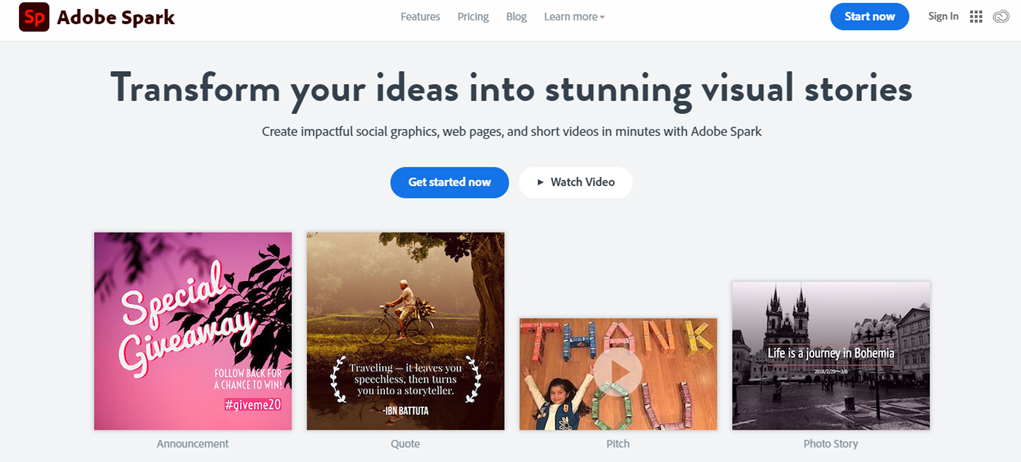
Adobe Spark is part of the Adobe package that includes both Photoshop and Illustrator. As we said in the previous part, we will not deal with advanced tools here, so Spark is a basic editor and is intended for inexperienced designers. When you open the app, choose one of the basic suggestions or some premium templates that are very cheap. Add your logo, images, text, and voila. You have your perfect cover art.
2. Canva
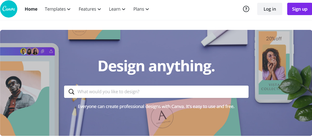
Canva is in many ways similar to Adobe Spark in that it is very easy to use, and it’s free. It is used by influencers, YouTubers, and podcasters. It can be used to create any design, and you will probably use it to create content for social media as well. The creative process is rather straightforward, and you can create your own template or use the ready-made ones. Canva also offers a lot of tutorials to make designing easier for you, and we recommend that you play around with it a bit to find out how it works.
3. Fiverr

While it may be somewhat different from the apps we’ve listed so far, you can still use Fiverr to hire a real graphic designer. Now, you’re wondering didn’t we say you wouldn’t spend a lot of money? Well, on Fiverr, you can find graphic design services for $5, and it’s quite legitimate. You should take your time and take a good look at the site because it has tons of talented people capable of making memorable designs for your cover art. Just look around, and you’re sure to find something of use.
4. Snappa
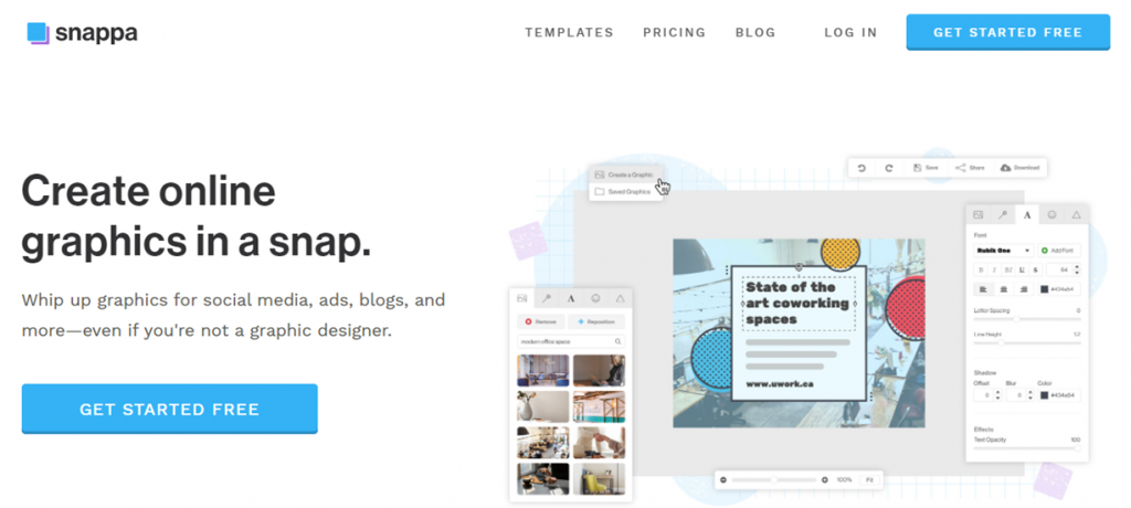
Just another useful tool in a series of handy helpers you can use to design your cover art. What sets this tool apart from the above-mentioned is that Snappa already provides you with some copyright-free photos you can use for your designs and over 6,000 free templates for only $ 10 a month. It also comes with social media integration that makes managing social networks that much easier. Sounds great? Try it.
5. Stencil
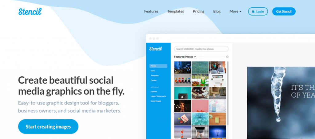
Stencil is another tool that can aid you in creating cover art, but you can also use it for running social networks. Stencil offers a complete range of graphics services, so you can choose any option you like. The only drawback of this tool is that it has a smaller number of templates to choose from when compared to other tools on this list. So, if you’re not the most creative of types, maybe this isn’t your best solution unless you find a template you really like, of course.
Some Examples of Well-Designed Cover Art
After a few graphics design tips, more precisely, the rules that you should adopt when creating cover art, and some tools you could use to create it, we also picked out a few well-designed ones that could serve as inspiration. All three of these are unique, creative, and perfectly correspond to what the podcast is actually about.
Unsolved Crimes Podcast
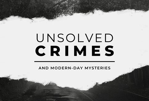
This is the cover of a true-crime podcast. As you can see, it fits the mood and the theme perfectly. It’s black and white, and everything seems dimmed and misty. It gives out a creepy and unsettling vibe, just perfect for a true-crime-themed podcast.
This is Your Life Podcast

Our next example is the cover art of This is Your Life Podcast. It feels warm, personal, and inviting. Just what’d you expect from a one-on-one chat type of podcast.
Star Wars Podcasts
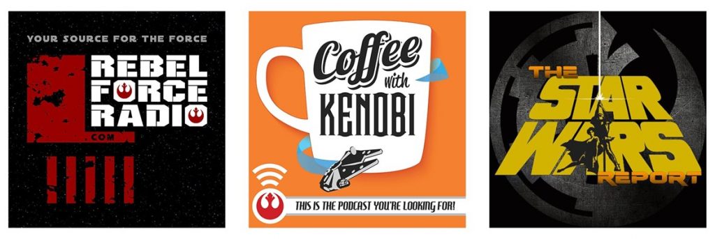
We decided to put all of these under the same category as the basic idea behind them is the same. They all look whimsical, entertaining, and suit the theme well. Just right for Sci-Fi and comic book buffs.
Conclusion
This was our “little guide” to creating the cover art of your podcast, in which we made an effort to cover everything in one place. The cover art of your podcast is a crucial element. It’s the first thing you new potential listeners will see, and so it must tickle their fancy. If they find the cover boring, they probably won’t check it out at all.
When it comes to the actual design, it’s always good to send your draft to friends and see how they react. Ask them to be honest with you. So use the tips we have for you, try some of the tools and let our suggestions be your inspiration.
