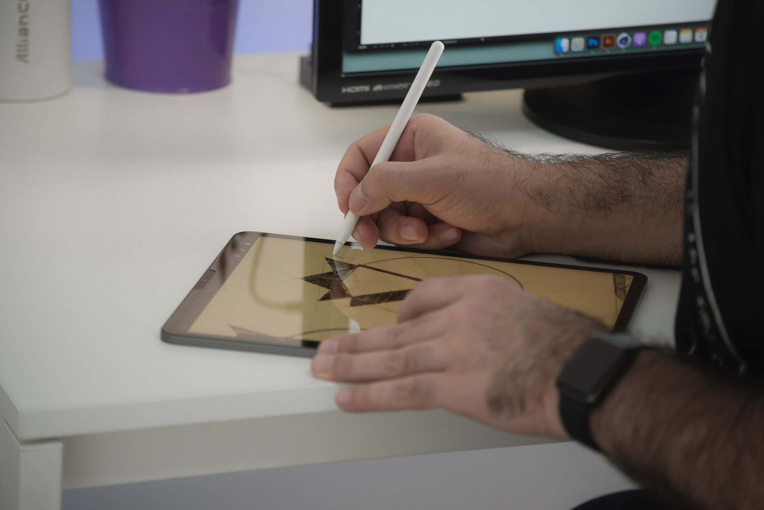
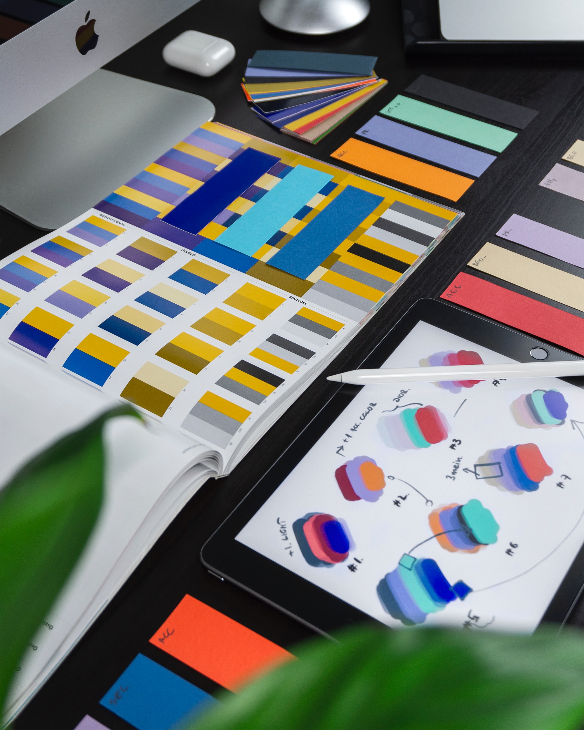
When it comes to running a business, or specific marketing it to an audience, no aspect is more important than visuals. By catching the eye of your customers you’re almost guaranteeing that they’ll go to your website. Having a strong logo to bolster traffic is great, but having a proper design can be so much more than that.
For example, imagine Coca-Cola. Without even a millisecond of your brain processing those words, you immediately know its logo and the iconic shape of its glass bottle. Having an image that ties together your business is key to beating your competition. It makes you stand out, and it makes your products easier to remember. Granted, Coca-Cola has millions of dollars behind its marketing team so it can really penetrate into people’s everyday lives. So much so that they even managed to rebrand Santa with it. But no matter the budget a proper design and a good logo can tie together all the aspects of your business together. Oftentimes small businesses neglect to choose a proper logo or design. And as a consequence, their business looks disjointed from their social media profiles, end products, and other services.
By putting proper effort into building a logo, you’re ensuring the growth and cohesion of your business. And to help you create your perfect logo here are the 6 must-follow steps for creating a better logo.
A guide to better logos

1. Understand what your business needs
The trick in creating logos is that each and each one is completely unique. There might be similarities, but they are never 100% the same. That’s why, even before you start the creation process you need to consider what your business is, what makes it unique, and how should your logo serve it. This also includes thinking about themes, schemes, and other details. For example, having a logo of a mortuary be full of sunshine, rainbows, and flowers is distasteful and you need to consider a more thematically appropriate logo for your design. Designing logos means putting the essence of your business and its need into a simple visual package.
2. Create variations
Don’t be afraid to experiment. Creating logos is a hard process and you will make mistakes. That’s why you should create a lot of variations in your logo prototypes. Through them, you’ll see what works and what doesn’t. In the end, you might like how one option works, but you might also create a completely new logo from various aspects of the variations. Only using one logo for your entire design process railroads your creativity into thinking that’s the only option. When in reality your perfect logo design might be something you would’ve never thought of. That’s why you should experiment as much as possible, to bring out as much creativity as you can.
3. Consider Scalability
Your logo needs to be perfect everywhere. Not just in your mind or your monitor. This includes anything you can think of, mobile devices, tablets, flyers, billboards, digital display boards and so on. Creating a logo means creating a design that works on any scale, from the size of a button to the size of a blimp. In essence, this generally means you don’t want to make your logo overly detailed, as details tend to get lost when changing the scale of the logo. While this step is far more important for physical businesses, let’s not forget that there are plenty of scaling issues in digital businesses too. You’ll never know what type of device your visitor may be viewing your logo. Therefore you should be ready for your logo to be displayed on any type of device.
4. Aim For Timelessness
A big problem with certain logos is that they seem dated. It doesn’t matter if the company was created yesterday or in the 1960s a bad logo will make it seem as if you’re not in business. By creating a timeless logo you’re giving yourself far less work in the future. Instead of having to constantly update it, you can just relax and go about your work.
5. Build a Surrounding Design
One of the biggest mistakes businesses do when they create their logo is that they don’t update the rest of their designs. This can lead to color clashes and other issues. Design changes can vary in intensity, from just changing a background on your website to fully rebranding your business. A good example of that is how Mcdonald’s changed from red and yellow to more muted colors at the turn of the century.
6. Test the Logo
And finally, you need to test your logo. This can be done in various ways, from polling people on the street to running some test ads. No matter what technique you use, make sure to listen to their feedback and apply it before releasing your logo to the public.
Conclusion

No matter how big or small, minimalistic or detailed your logo is putting proper effort into it allows your business to grow. And with these 6 simple steps, you’ll have a flourishing business that everyone remembers due to a unique logo.
